Vision Science
ColorAssim brings the color assimilation illusion to life on your own face — a striking demonstration of how context shapes color perception.
Try it now
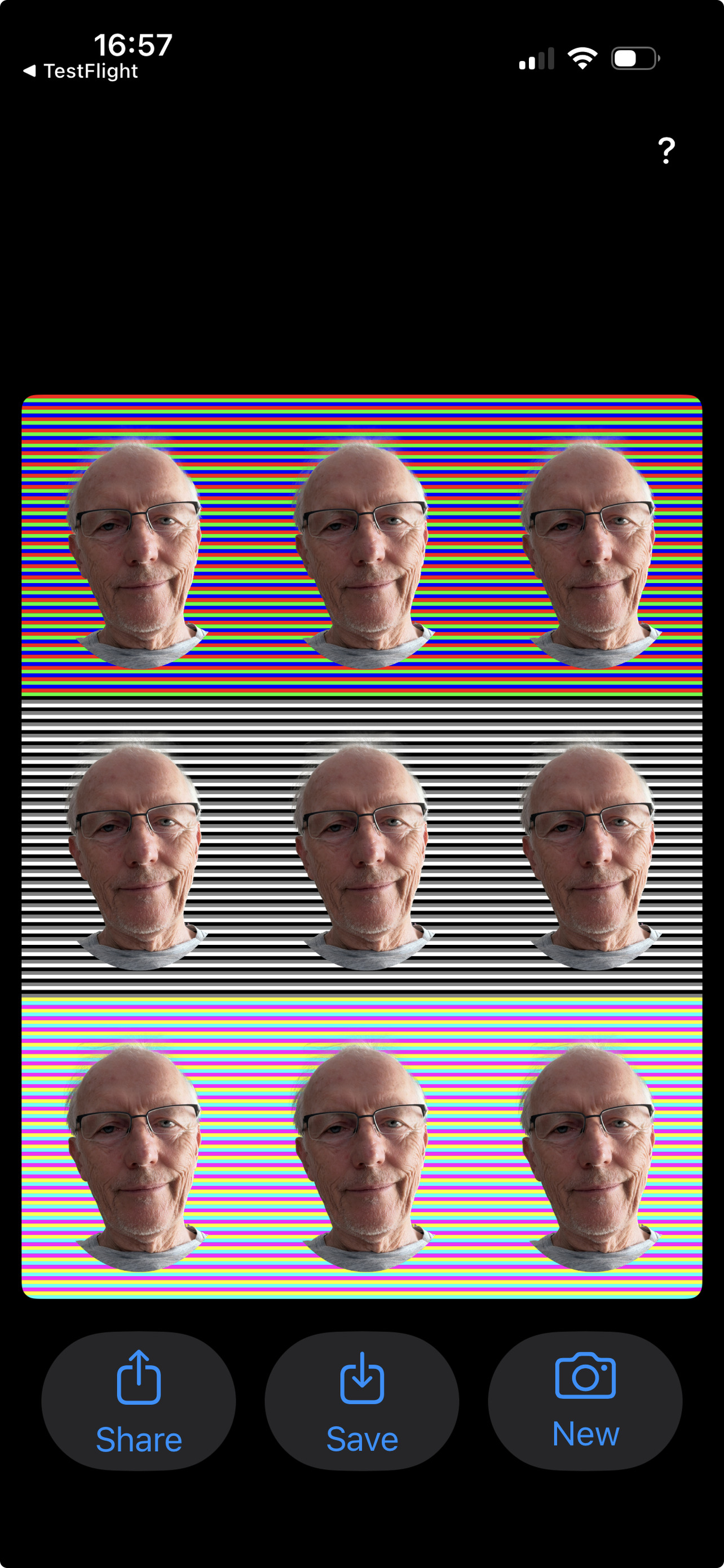
This is the same face rendered four different ways by the app. In each panel a different stripe color sits on top of the face, shifting the perceived skin tone through color assimilation.

It's the same face in all four panels — only the stripe color changes. Red, green, and blue stripes sit in front of the face in the first three panels; the rightmost shows the face without foreground stripes.
The app
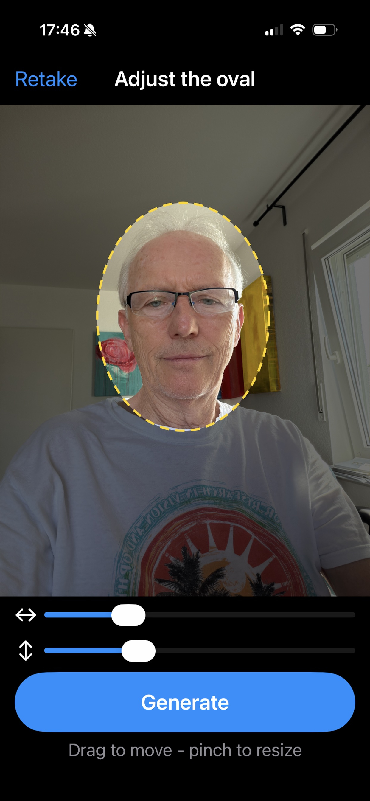
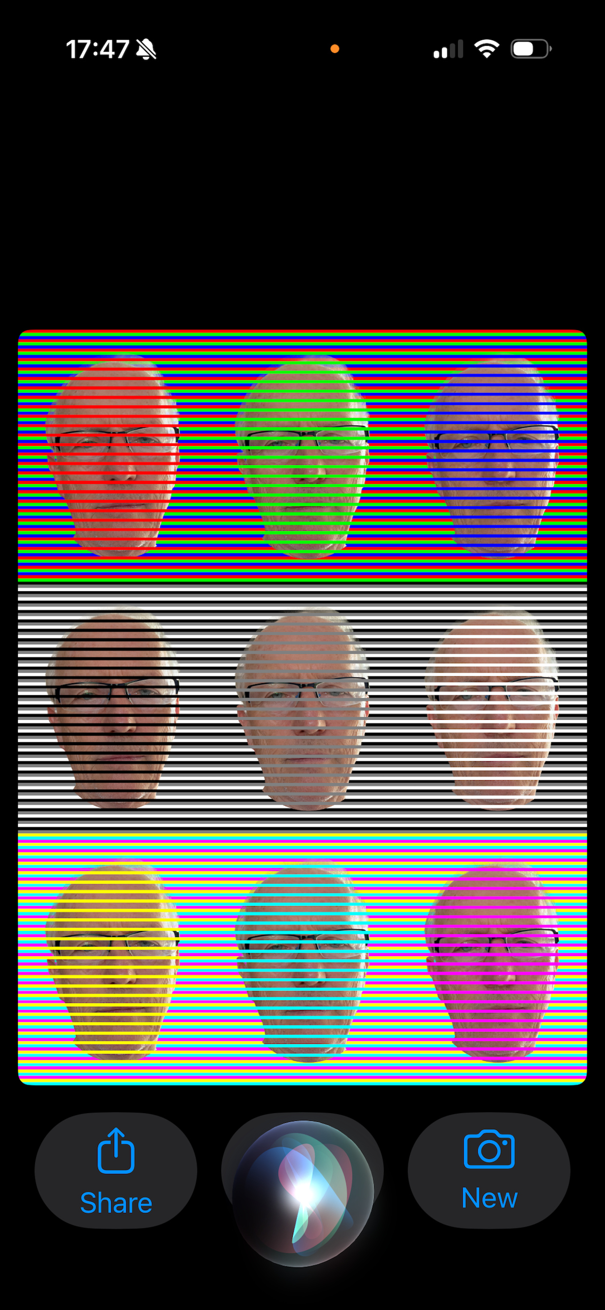
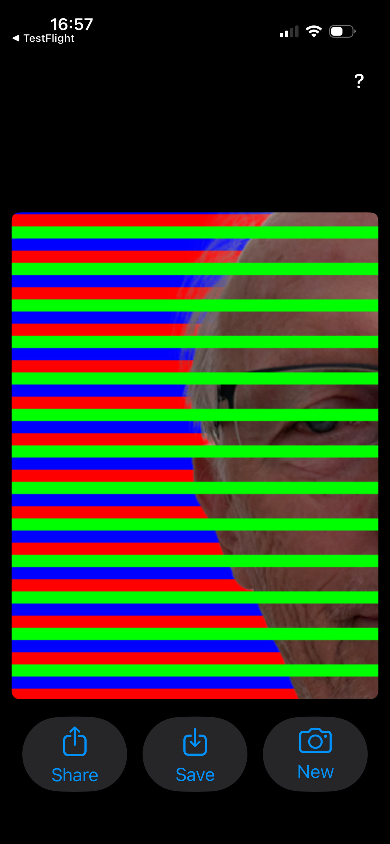
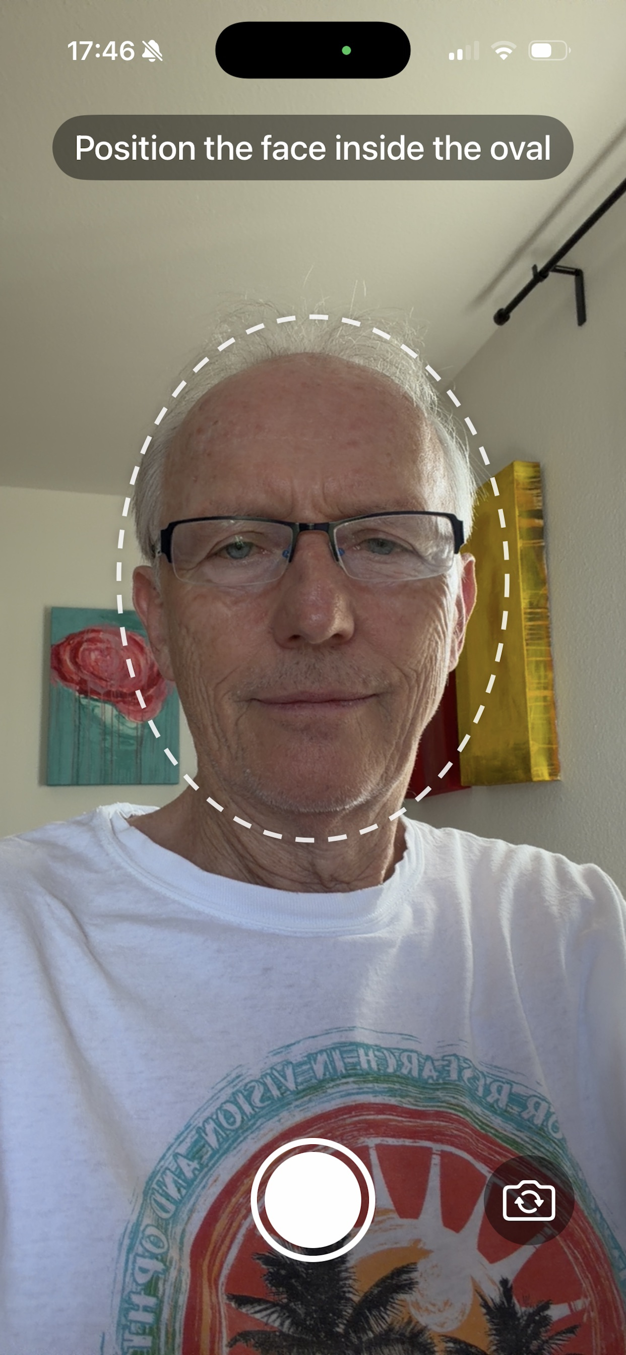
Three steps: position your face, fine-tune the oval, then generate a 3×3 grid with nine stripe combinations — red, green, blue, black, white, gray, cyan, magenta, and yellow. Then put the illusion to the test: tap to lift the stripes off your face, and pinch in to see that the pixels never changed.
Position your face
Adjust the oval
See nine versions
Tap — the stripes lift, the face never changed
Pinch — inspect the very pixels
Peer-reviewed science
ColorAssim is based on research published in iPerception (2024) by Karl Gegenfurtner at Justus Liebig University Giessen. The paper demonstrates how color assimilation — the same visual mechanism that makes differently striped faces look different in hue — explains why oranges in mesh bags look ripe even when they are not.
Read the paper → doi:10.1177/20416695241258748The research was awarded the Psychology Prize at China's 13th Pineapple Science Award (菠萝科学奖), presented in Hangzhou on November 23, 2024. Often called "China's Ig Nobel Prize," the award celebrates imaginative research that makes people curious about science. In his acceptance video, Karl noted that he loves oranges and pineapples — but still recommends taking the fruit out of the net before paying at the supermarket.
As seen on social media
Short-form explainers from Scientific American brought the color assimilation illusion to viral audiences on TikTok and Instagram.
The origin story
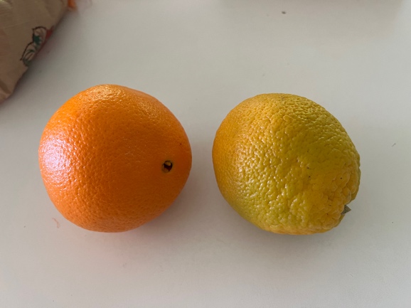
These two fruits are both oranges from the same bag. The one on the right is simply less ripe — its skin is more yellow than orange. Yet when placed inside an orange-colored net bag, it looks just as ripe as its neighbor.
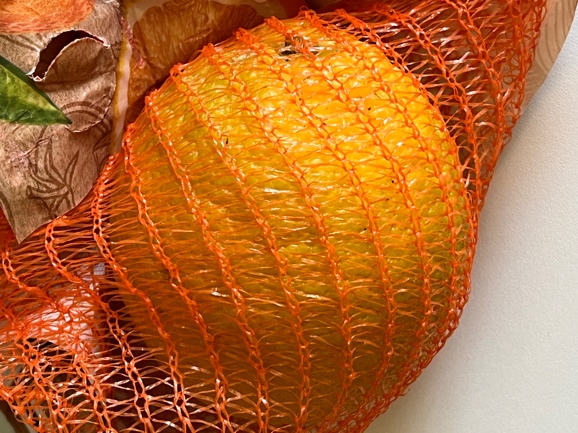
The orange net's thin strands create exactly the same assimilation effect as the stripes in the demo above. The surrounding orange color "spreads" into the perceived color of the fruit.
This is why citrus growers have used orange nets for decades — not just to protect the fruit, but because customers perceive netted fruit as riper and more appealing.
Here the same yellow-green orange sits inside an orange mesh bag. Notice how the color of the fruit now appears much more saturated and orange — identical to a fully ripe fruit.
This striking example of color assimilation inspired the research paper Perceptual Ripening of Oranges, published in iPerception in 2024.
A 150-year story
Scientists and artists have studied this effect for over a century — yet it still surprises everyone who sees it.
German meteorologist and physicist Wilhelm von Bezold described how thin colored lines cause surrounding colors to appear to spread or "assimilate" into adjacent areas. The effect is still known as the Bezold spreading effect.
Bezold, W. v. (1874). Die Farbenlehre im Hinblick auf Kunst und Kunstgewerbe. Westermann.
In his landmark book, the painter and Bauhaus teacher Josef Albers systematically explored how colors influence each other's appearance — including assimilation effects — fundamentally shaping how designers and artists understand color.
Albers, J. (1963). Interaction of color. Yale University Press.
Hans Schober and Harald Munker described a powerful form of color assimilation using overlapping grids of colored lines. Michael White later showed a related brightness assimilation — regions of the same gray appear lighter or darker depending on the stripes surrounding them.
Schober, H., & Munker, H. (1967). Untersuchungen zu den Übertragungseigenschaften des Gesichtsinns für die Farbinformation. Vision Research, 7(11–12), 1015–1026.
White, M. (1979). A new effect of pattern on perceived lightness. Perception, 8(4), 413–416.
Pioneering work by Patrick Monnier and Steven Shevell provided detailed psychophysical measurements of color assimilation, establishing how strongly stripe color, stripe width, and spatial frequency influence the perceived hue shift.
Monnier, P., & Shevell, S. K. (2003). Large shifts in color appearance from patterned chromatic backgrounds. Nature Neuroscience, 6(8), 801–802.
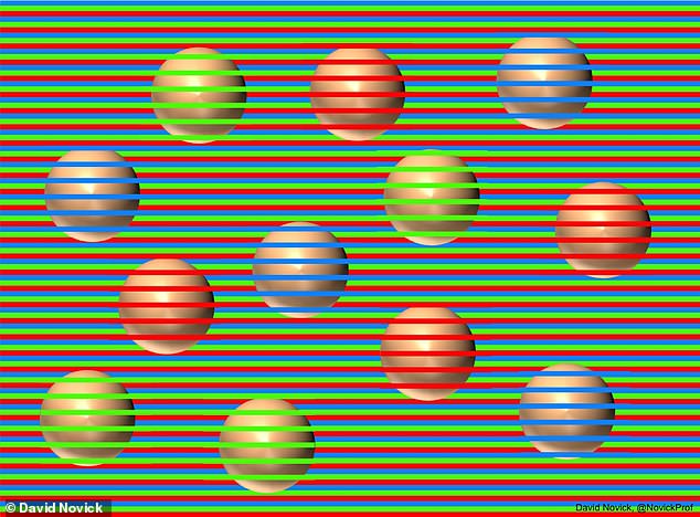
David Novick and Akiyoshi Kitaoka created a striking image in which twelve spheres all appear to be different colors — yet every sphere is physically identical. The image went viral, bringing color assimilation to millions of people for the first time.
Novick, D., & Kitaoka, A. (2021). The confetti illusion. Journal of Illusion, 2, 6152.
Karl Gegenfurtner's paper in iPerception connected color assimilation to an everyday phenomenon: the orange mesh bags used by citrus growers make unripe, yellowish fruit appear fully ripe — a striking example of how the visual system is fooled by context in real life.
Gegenfurtner, K. R. (2024). Perceptual ripening of oranges. i-Perception, 15(4), 1–5.
A striking example
Hard to believe — but true. The colored horizontal stripes surrounding each sphere shift its perceived hue entirely through color assimilation.
Image © 2021 David Novick and Akiyoshi Kitaoka, licensed under CC BY-NC-ND 4.0. — Novick, D., & Kitaoka, A. (2021). The confetti illusion. Journal of Illusion, 2, 6152. doi:10.47691/joi.v2.6152 →
Free. No account needed. Works with pets too.
Acknowledgments
This project was supported by European Research Council ERC AdG Color 3.0 (884116), by DFG Sonderforschungsbereich SFB/TRR 135 (222641018), and by DFG Excellence Cluster EXC 3066/1 “The Adaptive Mind” (533717223).